
Flutter에서 사용할 수 있는 다양한 버튼 유형들을 나열하겠습니다. 각 버튼의 주요 특징과 사용 예시도 함께 설명합니다.
1. ElevatedButton
– 설명: 기본적으로 튀어나와 있는 효과를 주는 버튼. Material Design 스타일의 주요 버튼으로 사용됨.
– 사용 예시:
  ElevatedButton(
       onPressed: () {
         // 버튼 클릭 시 실행될 코드
       },
       child: Text('Elevated Button'),
     )
2. TextButton
– 설명: 기본 스타일이 없는 텍스트 버튼. 일반적으로 툴바나 다이얼로그에서 사용됨.
– 사용 예시:
TextButton(
       onPressed: () {
         // 버튼 클릭 시 실행될 코드
       },
       child: Text('Text Button'),
     )
3. OutlinedButton
– 설명: 외곽선이 있는 버튼. ElevatedButton보다 덜 강조된 액션을 위해 사용됨.
– 사용 예시:
     OutlinedButton(
       onPressed: () {
         // 버튼 클릭 시 실행될 코드
       },
       child: Text('Outlined Button'),
     )
4. IconButton
– 설명: 아이콘을 사용한 버튼. 주로 툴바나 어플리케이션 바에서 사용됨.
– 사용 예시:
     IconButton(
       icon: Icon(Icons.thumb_up),
       onPressed: () {
         // 버튼 클릭 시 실행될 코드
       },
     )
5. FloatingActionButton
– 설명: 화면 위에 떠 있는 동그란 버튼. 주요 액션을 위해 사용됨.
– 사용 예시:
     FloatingActionButton(
       onPressed: () {
         // 버튼 클릭 시 실행될 코드
       },
       child: Icon(Icons.add),
     )
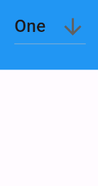
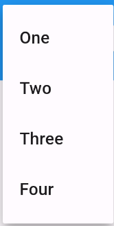
6. DropdownButton
– 설명: 드롭다운 리스트를 제공하는 버튼. 여러 옵션 중 하나를 선택할 수 있게 함.
– 사용 예시:
     String dropdownValue = "One";

     DropdownButton<String>(
       value: dropdownValue,
       icon: Icon(Icons.arrow_downward),
       onChanged: (String? newValue) {
         setState(() {
           dropdownValue = newValue!;
         });
       },
       items: <String>['One', 'Two', 'Three', 'Four']
           .map<DropdownMenuItem<String>>((String value) {
         return DropdownMenuItem<String>(
           value: value,
           child: Text(value),
         );
       }).toList(),
     )
7. PopupMenuButton
– 설명: 팝업 메뉴를 표시하는 버튼. 추가 옵션이나 설정을 제공할 때 사용됨.
– 사용 예시:
     PopupMenuButton<String>(
       onSelected: (String result) {
         setState(() {
           _selectedMenu = result;
         });
       },
       itemBuilder: (BuildContext context) => <PopupMenuEntry<String>>[
         const PopupMenuItem<String>(
           value: 'One',
           child: Text('One'),
         ),
         const PopupMenuItem<String>(
           value: 'Two',
           child: Text('Two'),
         ),
       ],
     )
8. BackButton / CloseButton
– 설명: 뒤로 가기 버튼 및 닫기 버튼. 보통 AppBar에서 사용됨.
– 사용 예시:
     AppBar(
       leading: BackButton(
         onPressed: () {
           Navigator.pop(context);
         },
       ),
     )

     AppBar(
       leading: CloseButton(
         onPressed: () {
           Navigator.pop(context);
         },
       ),
     )
이 외에도 커스텀 버튼을 만들기 위해 `GestureDetector`, `InkWell`, `RawMaterialButton` 등 다양한 위젯을 활용할 수 있습니다.